
19.5.2. Slide Marquee Style
Description of an animation of the slide marquee style:
At the beginning, the marquee block is off one side (left side or right side. It depends on the value of the -wap-marquee-dir WCSS property) of the mobile device's screen totally.
Then the marquee block scrolls to the other side of the mobile device's screen.
If the length of the marquee block is smaller than the screen width, the marquee block stops when it touches the other side of the screen. If the length of the marquee block is larger than the screen width, the marquee block stops once its ending edge is shown.
The animation repeats if the value of the -wap-marquee-loop WCSS property is larger than 1.
It may be difficult to imagine how a slide marquee animation actually looks in a WAP browser simply by reading the above textual description. Let's see an XHTML MP/WAP CSS example that demonstrates the usage of the slide marquee style and how it looks in some mobile phone browsers. In the following XHTML MP/WAP CSS example, the direction of the marquee animation is set to right-to-left.
<?xml
version="1.0"?>
<!DOCTYPE html PUBLIC
"-//WAPFORUM//DTD XHTML Mobile 1.0//EN"
"http://www.wapforum.org/DTD/xhtml-mobile10.dtd">
<html
xmlns="http://www.w3.org/1999/xhtml">
<head>
<title>WCSS
Tutorial</title>
</head>
<body>
<p
style="display: -wap-marquee; -wap-marquee-dir: rtl;
-wap-marquee-style: slide">Hello world.</p>
<p
style="display: -wap-marquee; -wap-marquee-dir: rtl;
-wap-marquee-style: slide">Hello, welcome to our WCSS
Tutorial.</p>
</body>
</html>
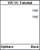
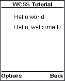
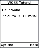
The following screenshots show the result of the above XHTML MP/WCSS example in a mobile phone browser. The length of "Hello world" is smaller than the screen width, while that of "Hello, welcome to our WCSS Tutorial." is larger than the screen width. As you can see in the screenshots, "Hello world" stopped when it touched the other side of the screen, while "Hello, welcome to our WCSS Tutorial." stopped once its ending edge was shown.
|
|
| Previous Page | Page 34 of 39 | Next Page |  |
- 1. WCSS (WAP CSS) Introduction
- 2. Wireless CSS and Wireless Profile CSS
- 3. Advantages of Using WAP CSS Style Sheets on Mobile Internet Sites
- 4. Disadvantages of Using WAP CSS Style Sheets on Mobile Internet Sites
- 5. Syntax Rules of WCSS
- 6. Comments in WCSS
- 7. How to Apply WCSS Styles to an XHTML MP Document
- 8. Different Types of Selectors
- 9. Div and Span Element of XHTML MP
- 10. Cascading Rules for Handling Multiple Groups of WCSS Styles Applied to the Same Element
- 11. Common Types of Property Value
- 12. WCSS Font and Text Properties
- 13. WCSS List Properties
- 14. WCSS Color Properties
- 15. WCSS Border Properties
- 16. WAP Specific Extensions to CSS
- 17. WCSS Access Key Extension
- 18. WCSS Input Extension
- 19. WCSS Marquee Extension
- 20. Matching WCSS Cascading Style Sheets to Different User Agents