
Adapting to User Devices
Luigi's Pizza On The Run mobile shop is working well now. And he wants to adapt it to different mobile devices. Let us learn that in this chapter! And specifically, let's look at:
Understanding the Lowest Common Denominator method
Finding and comparing features of different mobile devices
Deciding to adapt or not.
Adapting and progressively enhancing POTR application using Wireless Abstraction Library
Detecting device capabilities
Evaluating tools that can aid in adaptation
Moving your blog to the mobile web
By the end of this chapter, you will have a strong foundation in adapting to different devices.
What is Adaptation?
As we discussed in Chapter 1, adaptation, sometimes called multiserving, means delivering content as per each user device's capabilities. If the visiting device is an old phone supporting only WML, you will show a WML page with Wireless Bitmap (wbmp) images. If it is a newer XHTML MP-compliant device, you will deliver an XHTML MP version, customized according to the screen size of the device. If the user is on iMode in Japan, you will show a Compact HTML (cHTML) version that's more forgiving than XHTML. This way, users get the best experience possible on their device.
Do I Need Adaptation?
I am sure most of you are wondering why you would want to create so many different versions of your mobile site? Isn't following the XHTML MP standard enough?
On the Web, you could make sure that you followed XHTML and the site will work in all browsers. The browser-specific quirks are limited and fixes are easy. However, in the mobile world, you have thousands of devices using hundreds of different browsers.
You need adaptation precisely for that reason! If you want to serve all users well, you need to worry about adaptation. WML devices will give up if they encounter a <b> tag within an <a> tag. Some XHTML MP browsers will not be able to process a form if it is within a table. But a table within a form will work just fine. If your target audience is limited, and you know that they are going to use a limited range of browsers, you can live without adaptation.
Can't I just Use Common Capabilities and Ignore the Rest?
You can. Finding the Lowest Common Denominator (LCD) of the capabilities of target devices, you can design a site that will work reasonably well in all devices. Devices with better capabilities than LCD will see a version that may not be very beautiful but things will work just as well.
As a matter of fact, this is what we did in the last chapter. We decided to support only XHTML MP devices. To render across all screen sizes and handle sessions on our own, we decided to keep the page size down and use only basic WCSS. Most people take this approach because it's easier and faster. In Chapter 1, we saw the capabilities W3C has listed as the Default Delivery Context—or the minimum expected features. We can use that as our LCD and design our mobile site.
How to Determine the LCD?
If you are looking for something more than the W3C DDC guidelines, you may be interested in finding out the capabilities of different devices to decide on your own what features you want to use in your application. There is a nice tool that allows you to search on device capabilities and compare them side by side. Take a look at the following screenshot showing mDevInf (http://mdevinf.sourceforge.net/) in action, showing image formats supported on a generic iMode device.
|
|
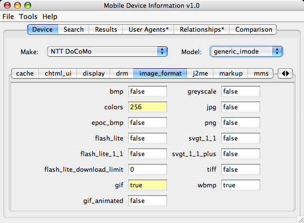
You can search for devices and compare them, and then come to a conclusion about features you want to use.
This is all good. But when you want to cater to wider mobile audience, you must consider adaptation. You don't want to fight with browser quirks and silly compatibility issues. You want to focus on delivering a good solution. Adaptation can help you there.
OK, So How do I Adapt?
You have three options to adapt:
Design alternative CSS: this will control the display of elements and images. This is the easiest method. You can detect the device and link an appropriate CSS file.
Create multiple versions of pages: redirect the user to a device-specific version. This is called "alteration". This way you get the most control over what is shown to each device.
Automatic Adaptation: create content in one format and use a tool to generate device-specific versions. This is the most elegant method.
Let us rebuild the pizza selection page on POTR to learn how we can detect the device and implement automatic adaptation.
| Page 1 of 4 | Next Page |  |